
Parameter
|
Name |
Description |
Type |
This is a required field |
Default |
Values |
|---|---|---|---|---|---|
|
Title of the box
|
|
string |
|
|
|
|
Width
|
Restrict the width of the container block. Example: 150px |
string |
|
|
|
|
Height
|
Restrict the height of the container block. Example: 200px |
string |
|
|
|
|
Show header icon
|
|
boolean |
|
false |
|
|
Header icon
|
|
string |
|
|
|
|
Header attachment icon
|
Any valid image url can be used. Used when parameter "Header icon" is not defined. |
string |
|
|
|
|
Header icon CSS class
|
Sets the class attribute of the element for styling or extended functionality. If you add the css class bv-create-button the create content dialog opens on click. |
string |
|
|
|
|
Show header button
|
|
boolean |
|
false |
|
|
Header button link
|
|
string |
|
|
|
|
Internationalization i18n key for the header button text
|
Any available i18n key can be used. |
string |
|
|
|
|
Header button icon
|
|
string |
|
|
|
|
Header button attachment icon
|
Any valid image url can be used. Used when parameter "Header button icon" is not defined. |
string |
|
|
|
|
Header button link or button
|
|
enum |
|
button |
button, primary_button, primary_button_inverse, link |
|
Header button CSS class
|
Sets the class attribute of the element for styling or extended functionality. If you add the css class bv-create-button the create content dialog opens on click. |
string |
|
|
|
|
Show footer button
|
|
boolean |
|
false |
|
|
Footer button link
|
|
string |
|
|
|
|
Internationalization i18n key for the footer button text
|
Any available i18n key can be used. |
string |
|
|
|
|
Footer button icon
|
|
string |
|
|
|
|
Footer button icon attachment
|
Any valid image url can be used. Used when parameter "Footer button icon" is not defined. |
string |
|
|
|
|
Footer button link or button
|
|
enum |
|
button |
button, primary_button, primary_button_inverse, link |
|
Footer button CSS class
|
Sets the class attribute of the element for styling or extended functionality. If you add the css class bv-create-button the create content dialog opens on click. |
string |
|
|
|
|
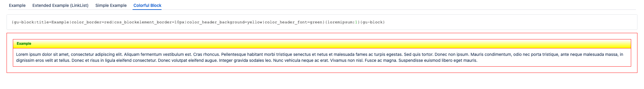
The color of the header (title) text
|
|
string |
|
|
|
|
The background color of the header element
|
|
string |
|
|
|
|
The background color of the content
|
|
string |
|
|
|
|
The color of the border
|
|
string |
|
|
|
|
Link text color
|
|
string |
|
|
|
|
Internationalization i18n key for the title
|
Any available i18n key can be used. |
string |
|
|
|
|
Content CSS class
|
A CSS class that is added to the div element content container |
string |
|
|
|
|
Block CSS class
|
A CSS class that is added to the wrapping blockelement div container |
string |
|
|
|
|
Adds an element that clears floating
|
If true, a line-break element with "clear float" declaration is rendered. This helps if some content is floating, e.g. buttons |
boolean |
|
false |
|
|
Show the header
|
|
boolean |
|
true |
|
|
Hide empty body
|
Hides the complete block if the content is empty. Attention: a block is only empty if there is no html inside. An empty div element isnt empty! |
boolean |
|
true |
|
|
Min/Max button
|
Show a minimize/maximize button in the header |
boolean |
|
true |
|
|
Minimized
|
The panel is minimized by default |
boolean |
|
false |
|
|
Content padding
|
The padding value of the content container (all sides). Padding is within the element. Example: 10px |
string |
|
|
|
|
Content type
|
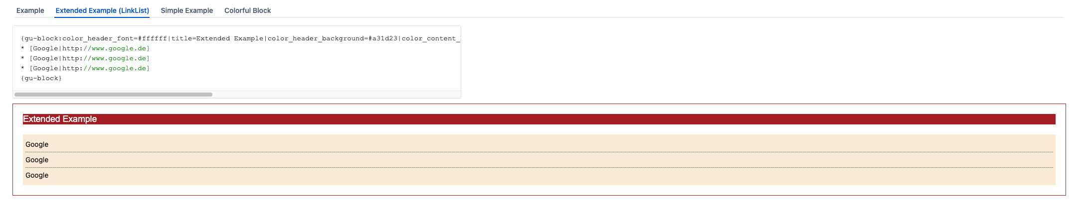
A predefined set of content representation. Example: if the child content is a link list, its possible to render a nice list display with separating lines. |
enum |
|
normal |
normal, linkListNormal, linkListDotted |
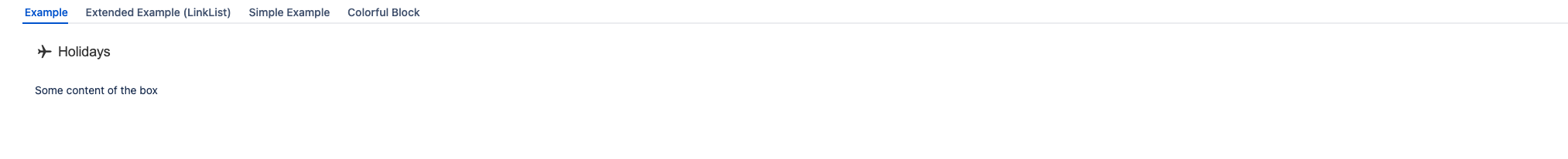
Examples
This helps, if some content ist floating, e.g. buttons