Chart option
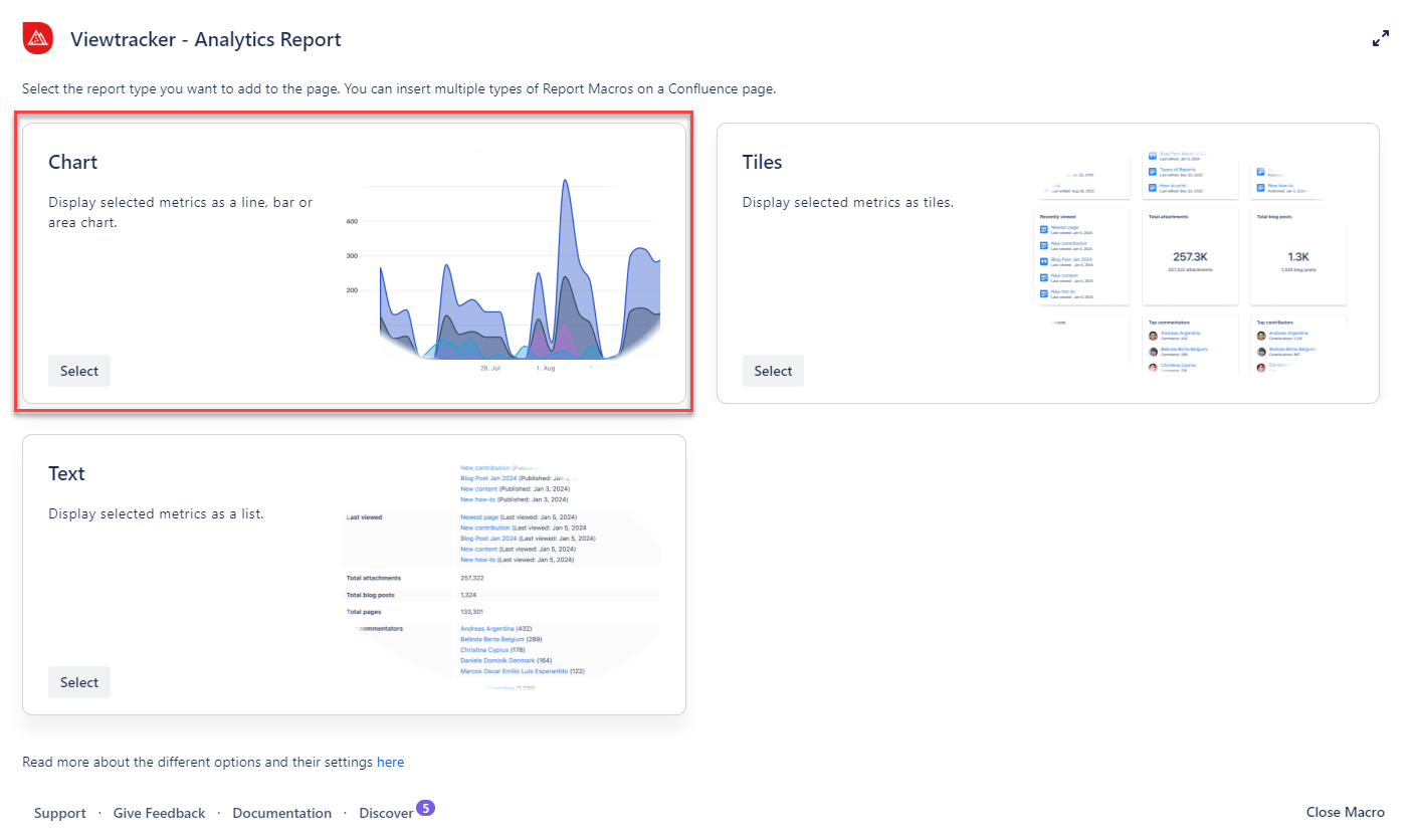
How to use the chart option?
-
Insert the Analytics Report macro.
-
Select “Chart” within the Analytics Report.
-
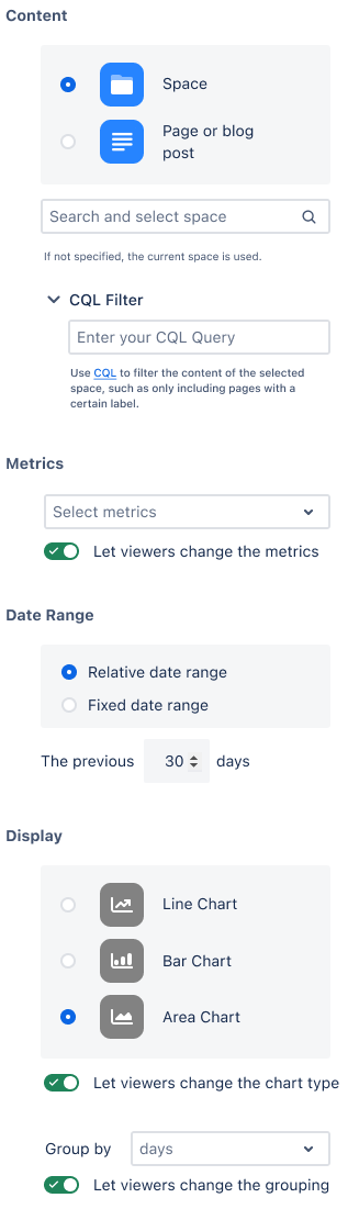
In the field “Content,” type in the name of a specific page (or space).
-
Adapt the general settings (see options below).
-
Use the preview to check if everything looks as expected.
-
-
Tap “Save” and publish the page.
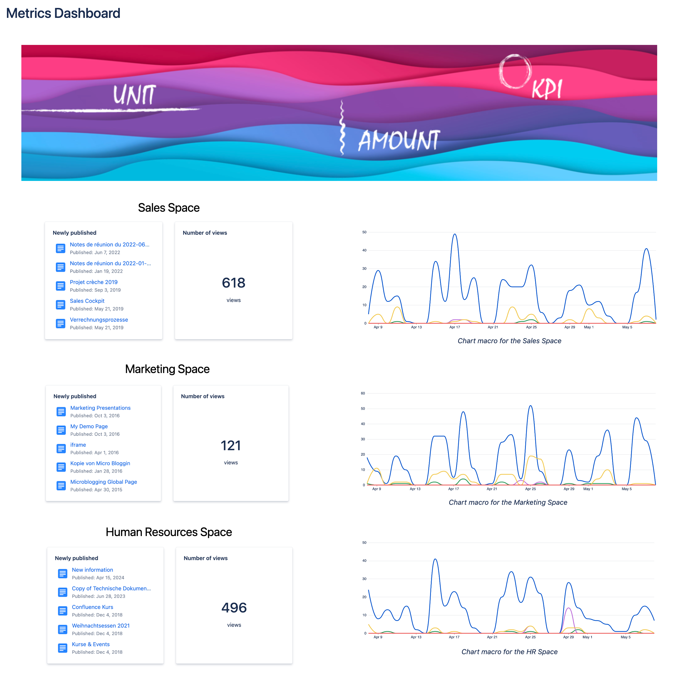
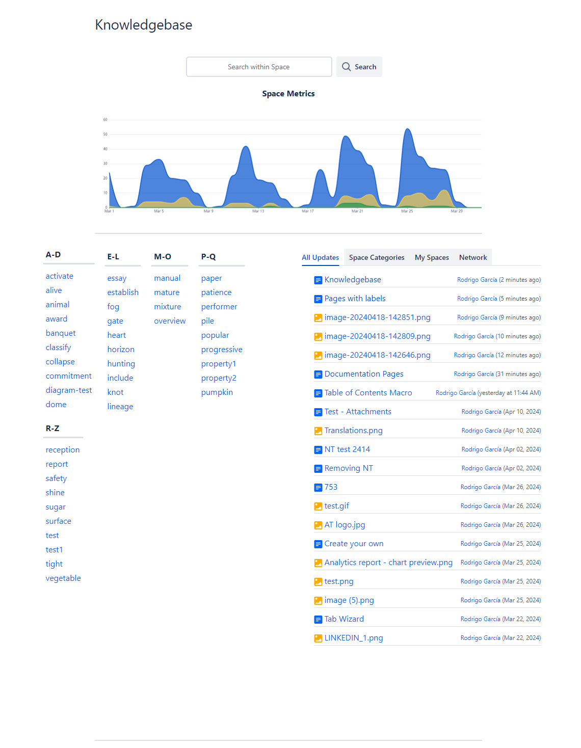
Result: The selected page or space metrics are displayed as a chart 🥳
General settings for this option
-
Content - Filters for a space, a page, or a blog post. You can further refine the selection using CQL when selecting a space.
-
Metrics - These filters are the same as those in the Viewtracker Reports (see the expand below).
-
Toggle: Turning this On will allow viewers to adjust these metrics.
-
-
Date Range - Two types of date ranges are available:
-
Relative: This default setting will continually update to maintain the “previous day.”
-
Fixed: You can manually specify the start and end date of the report data.
-
-
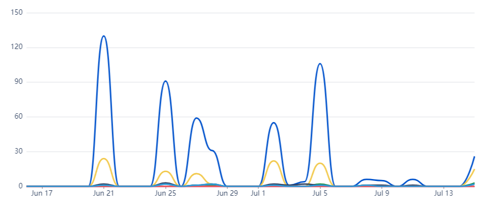
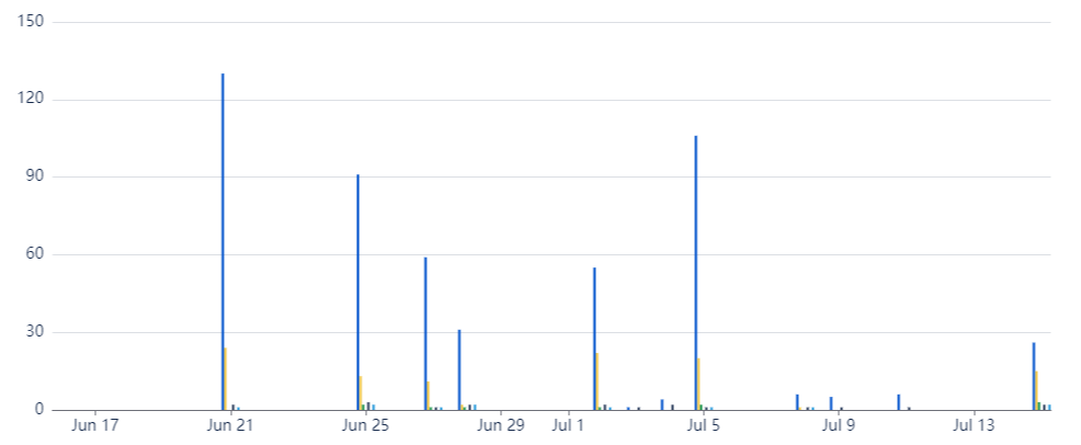
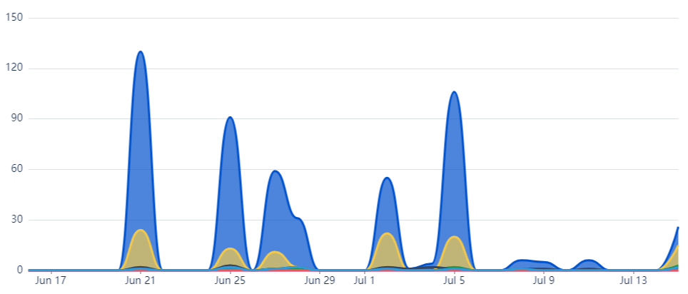
Display - You can select the type of chart to fit your style:
-
Line chart, bar chart or area chart.
-
Group data by day, weeks, month or years
-
Using the toggles, you can also permit viewers to change the chart type and grouping.
-
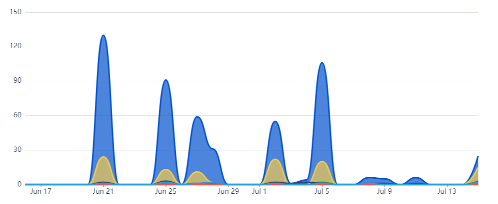
Types of charts available
Examples & use cases
Example 1: Tracking page activity
Would you like to display the number of views and the viewer activity for some of your content?
With this macro, you can easily compare the activity on your preferred pages by adding them as a source. No more visiting multiple pages separately.
Example 2: Present the performance of a space
Would you like to have an overview of your spaces and their activity?
You can configure this macro to display activity per space, helping you determine if your space is being actively utilized.
-
Showcase how the space is evolving to visitors or teammates.
-
Compare the activity of different spaces.
Example 3: Informing stakeholders
Would you like to provide your stakeholders with an up-to-date performance report?
With the chart option, you can display your desired metrics and integrate them with other macros to enrich and visualize the data.
-
Visualize how spaces or content are performing.
-
Use the Analytics Report macro's tile or text option to gain deeper insights into critical figures.