Chart Option
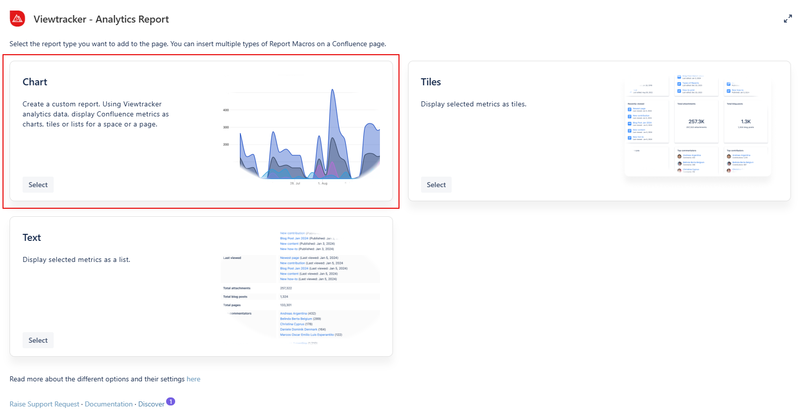
How do you use the chart option?
-
Insert the Analytics Report macro on a page.
-
Click “Chart” within the Analytics Report.
-
In the field “Content,” type in the name of a specific page or space.
-
Adapt the general settings (see options below).
Use the preview to check if everything looks as expected. -
Tap “Save” and publish the page.
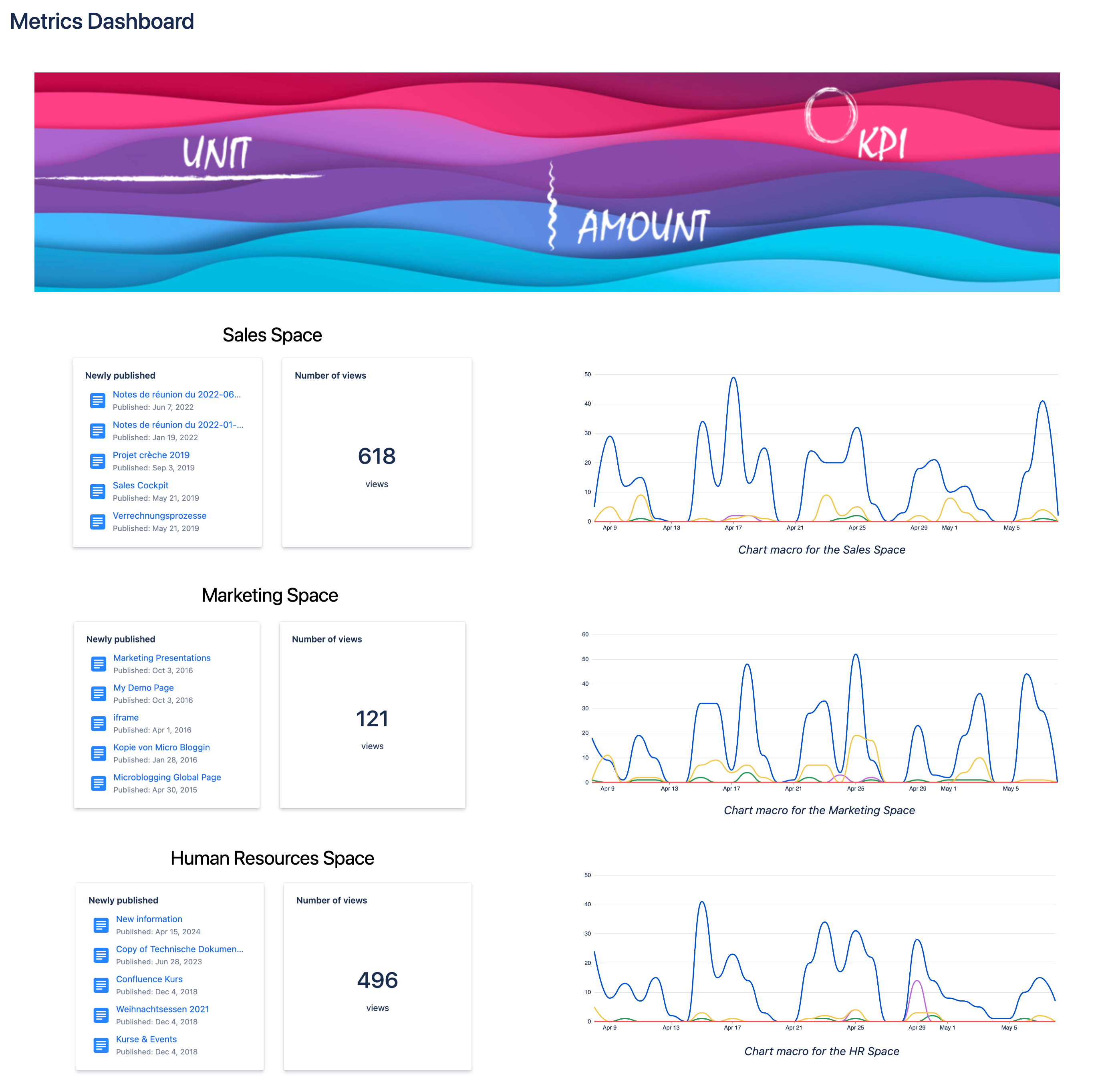
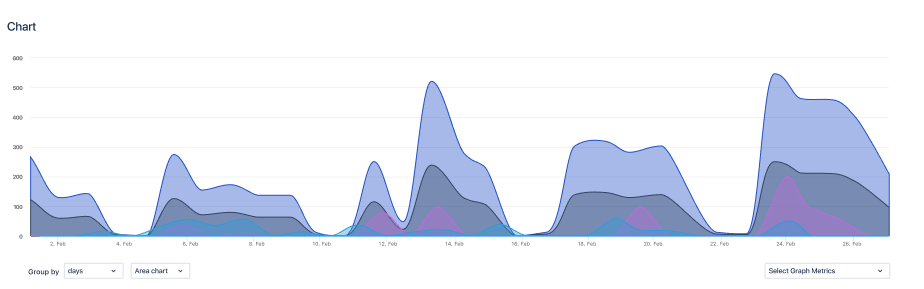
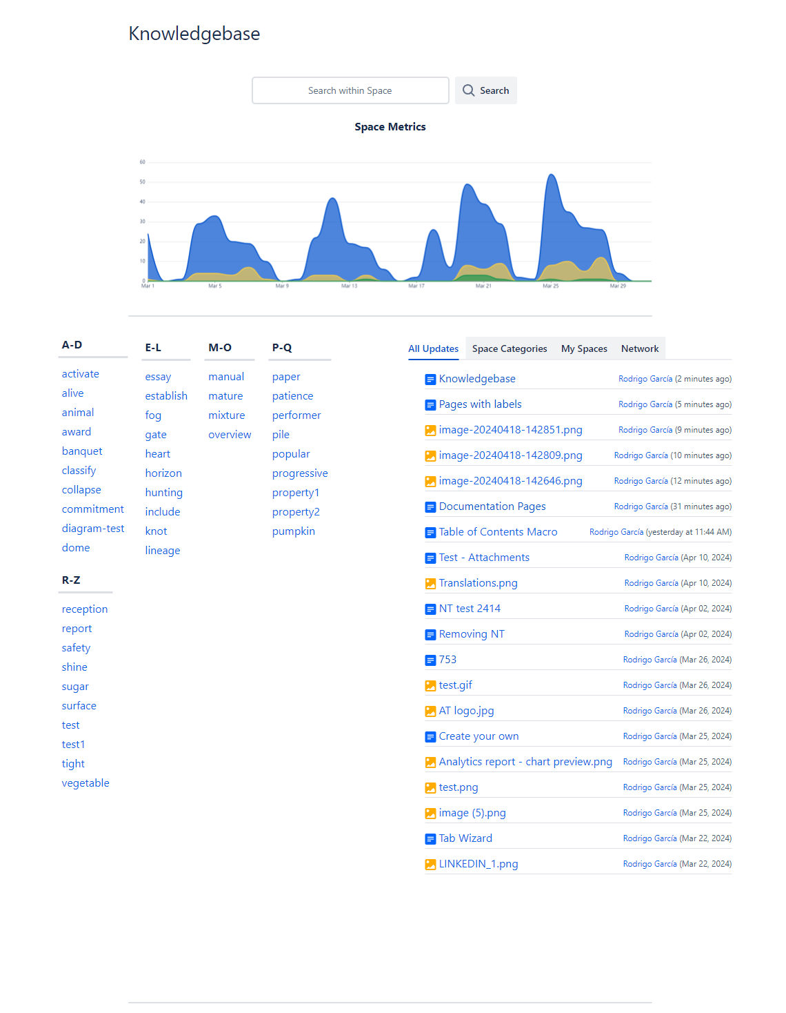
Result: The metrics of the selected page or space are displayed as a chart.
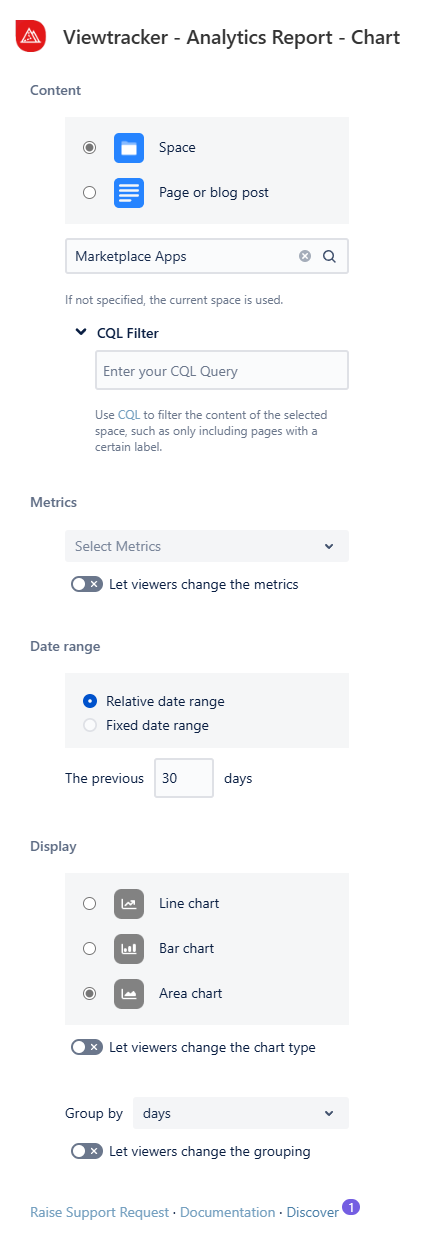
The general settings of this option
-
Content - You can filter for a space, a page, or a blog post.
-
CQL Filter: Use Confluence Query Language (CQL) to customize your report by applying specific filters.
-
-
Metrics - These are the same as those in the Viewtracker Reports (see the expansion below).
-
You can enable viewers to adjust metrics by activating this toggle.
-
-
Date Range - Two types of date ranges can be set:
-
Relative: The default setting. It will continually update itself to the previous day.
-
Fixed: Here, you can manually specify the start and end date of the report data.
-
-
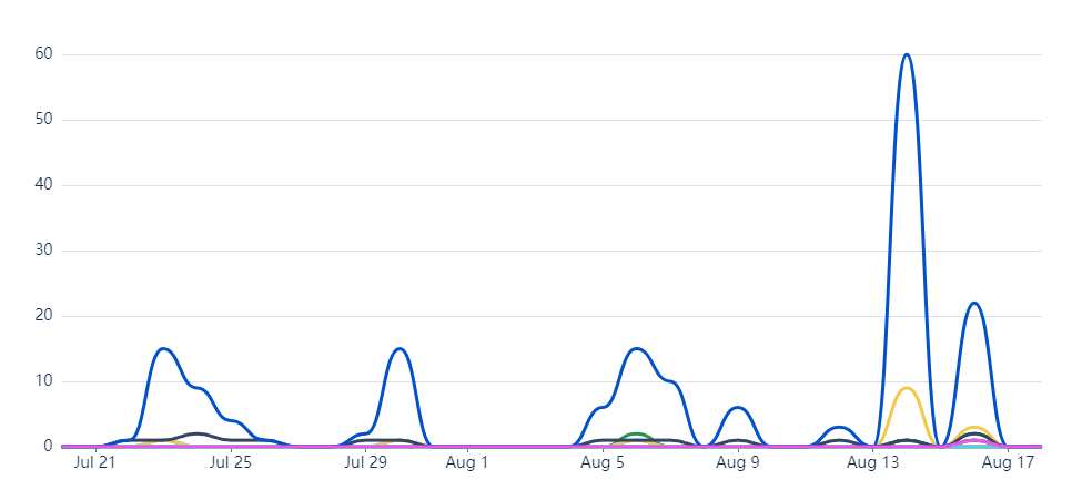
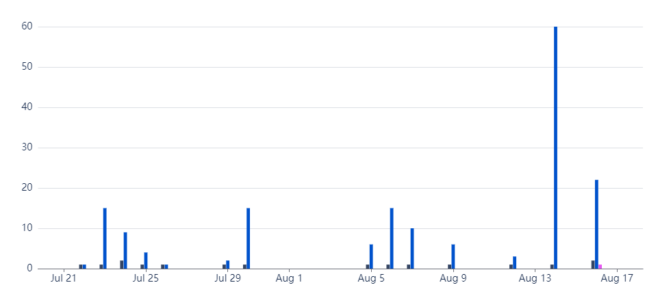
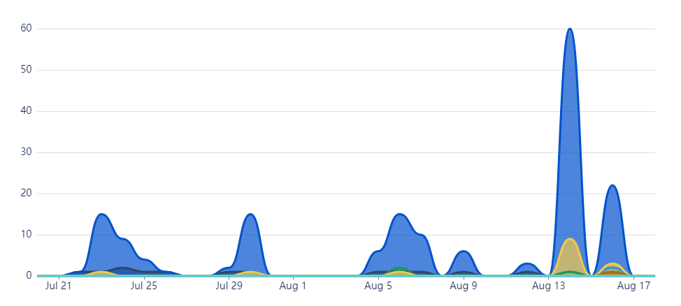
Display - Change the type of chart to fit your style by selecting one of the options:
-
Line chart, bar chart or area chart.
-
Group data by day, weeks, month or years
-
Using the toggles, you can also permit viewers to change the chart type and grouping.
-
Types of charts
Examples & use cases
Use case 1: Tracking page activity
Let's say you released an important set of information for your team on multiple Confluence pages and would like to display the views and viewers' activity for each page.
You can now easily compare the activity of your preferred pages by utilizing this macro and adding your pages as a source. Say goodbye to visiting multiple pages separately.
Use case 2: Measuring the performance of a space
Do you have spaces where you would like an overview of their activity?
You have the ability to configure this macro to display the activity per space, allowing you to determine if your space is actively being utilized.
-
Showcase to your visitors or superiors how the space is evolving.
-
Compare spaces among each other.
Use case 3: Informing stakeholders
Do you have to provide your stakeholders with an up-to-date performance report?
With the chart option, you can exhibit the metrics of your chosen spaces or content and integrate them with other macros to enrich and visualize the data.
-
Visualize how spaces or content are performing.
-
Place the Analytics Report macro’s tile or text option alongside to gain more insights into specific key figures.